This post is part of a series on Custom Elements. See the first post in the series for an introduction.
Custom elements are a great way of creating self-contained elements, and used in many frameworks, such as Onsen UI and Ionic. But, how do they ensure that the user’s own CSS doesn’t accidentally interfere with the framework’s CSS? This is where the shadow DOM comes in.
CSS Leaking
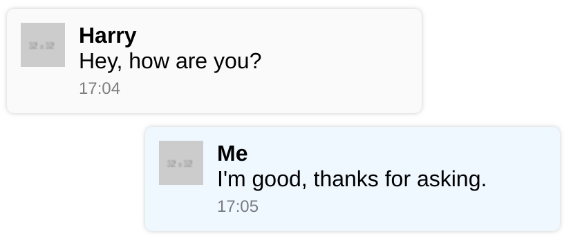
In our original custom elements example, we had a simple series of messages which used a custom element called custom-message. Inside this element, we automatically set up a div with the class message. Imagine that we publish our custom-message to be used by any developer who wants to use it, such as in Onsen UI or Ionic. For simplicity, we move the CSS into a style tag inside the component so it is completely standalone.
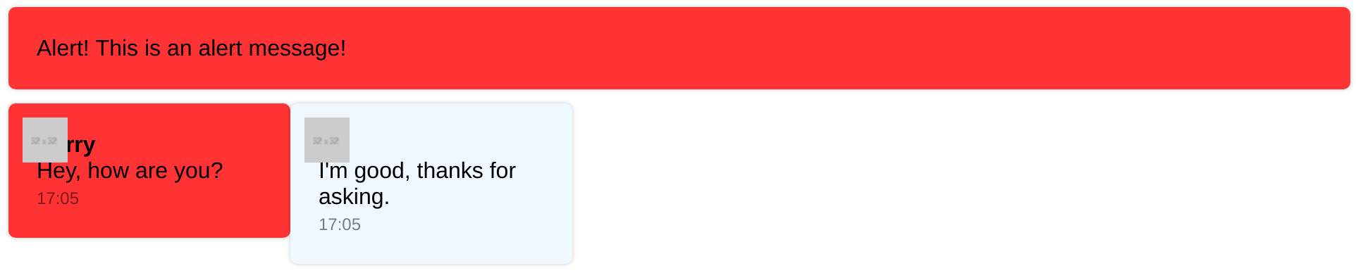
In this component, we are using very common class names, such as message. It’s very possible that any developer using our component will already have these classes defined in their own CSS files. Let’s create a notification alert which shows in a red bar which is 50% width, defined using the class message.
The result below is a screenshot of the changed Codepen example. The CSS of our custom-message affected, with both messages incorrectly sized, and one coloured red. Not only this, but the alert itself is affected by the custom-message’s CSS, as evidenced by its rounded borders and padding.
Preventing CSS Leaking
To prevent this, we want our component to only use its own CSS rules, and also not have its rules available outside of itself. We do this by attaching a shadow root inside the component’s constructor, before we put in any HTML.
constructor() {
  super();
  this.attachShadow({mode: 'open'});
  this.shadowRoot.innerHTML = TEMPLATE;
}
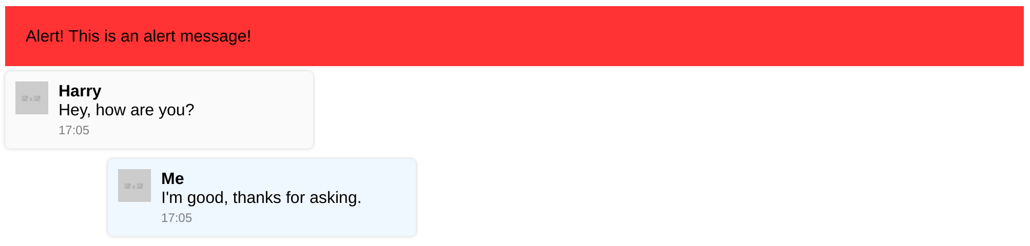
Notice also that we now do not set the innerHTML on the element directly, but rather on the shadow. We also need to change our selectors elsewhere in the code to use the shadow. The result is shown below (Codepen demo), where the CSS of the element and the alert are correctly separated.
Prevent access via JS
Not only does the shadow DOM prevent CSS leaking, but it also prevents Javascript usage. In the above Codepen example, try running document.querySelectorAll('.message') in the console. Though you might expect to get all three elements (the alert and two messages), you will only get the alert element because the query does not enter the shadow DOM.
Open vs Closed Mode
When you attach the shadow, you need to choose between open and closed mode. The only difference between the two modes is that in closed mode, this.shadowRoot is not set, and so you will need to store it by yourself (it is returned by the attachedShadow function). In theory, closed mode makes it harder to access the custom element’s shadow from outside, but in pratice it is easy to work around if needed. For ease of development, I recommend sticking with open.
More Custom Element features
Read the next article in the series about Slots to make your custom elements easier to use with rich content.